


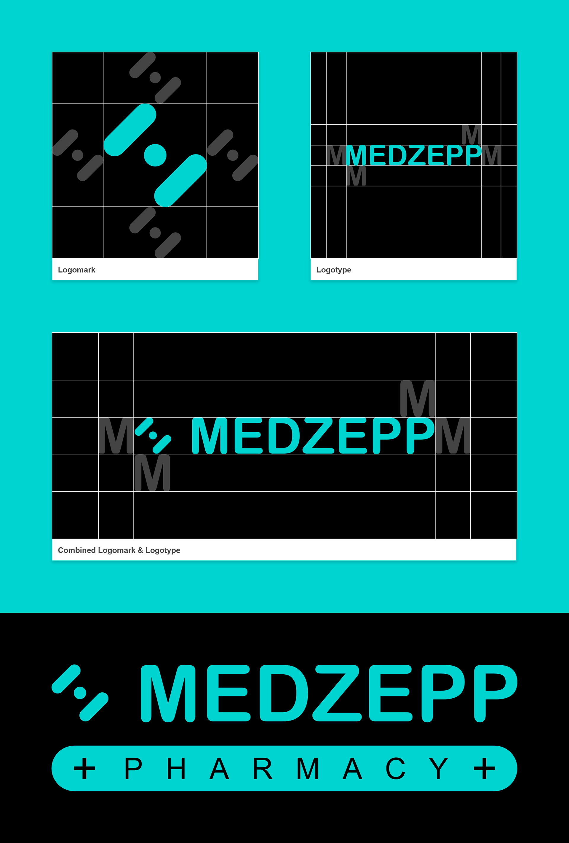
Clear Spacing and Margins
This practice prevents type, imagery or other graphic elements from interfering with the legibility of the logo. No graphic elements should encroach the border around the logomark. This space is determined by 50% height of logomark on each side. Measure the clear space for primary logomark by the height of the letter 'M'.


Best Practices/Don'ts'
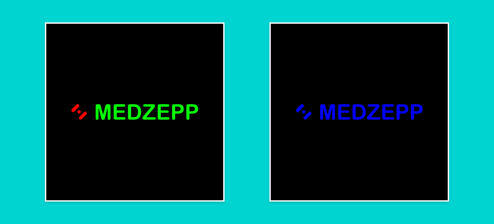
Color: Other than official brand color specifications, any color no matter how close it might look should be avoided and not used.
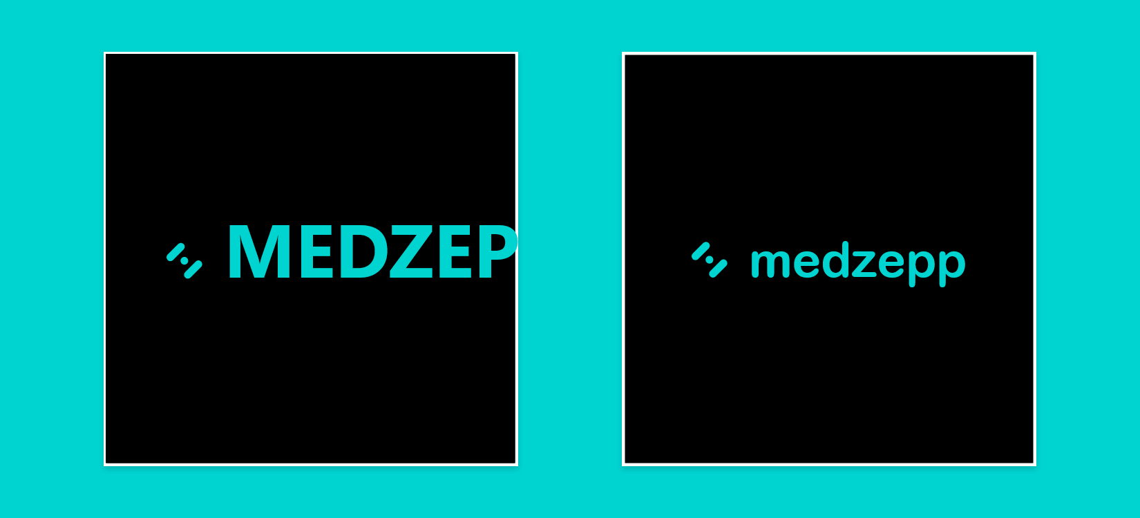
Fonts: Other than Arial Rounded Bold, any font no matter how close it might look should be avoided and not used.
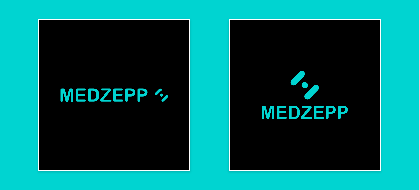
Logomark: There should not be resizing or change in the position of the logomark.
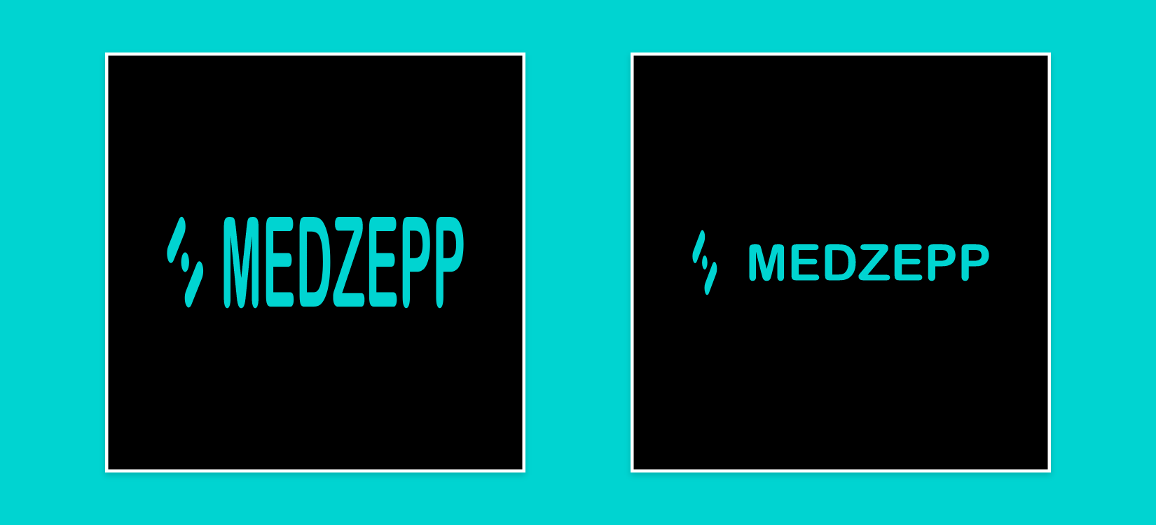
Sizing: Logo should not be squished or squashed. Any resizing must be in proportion.
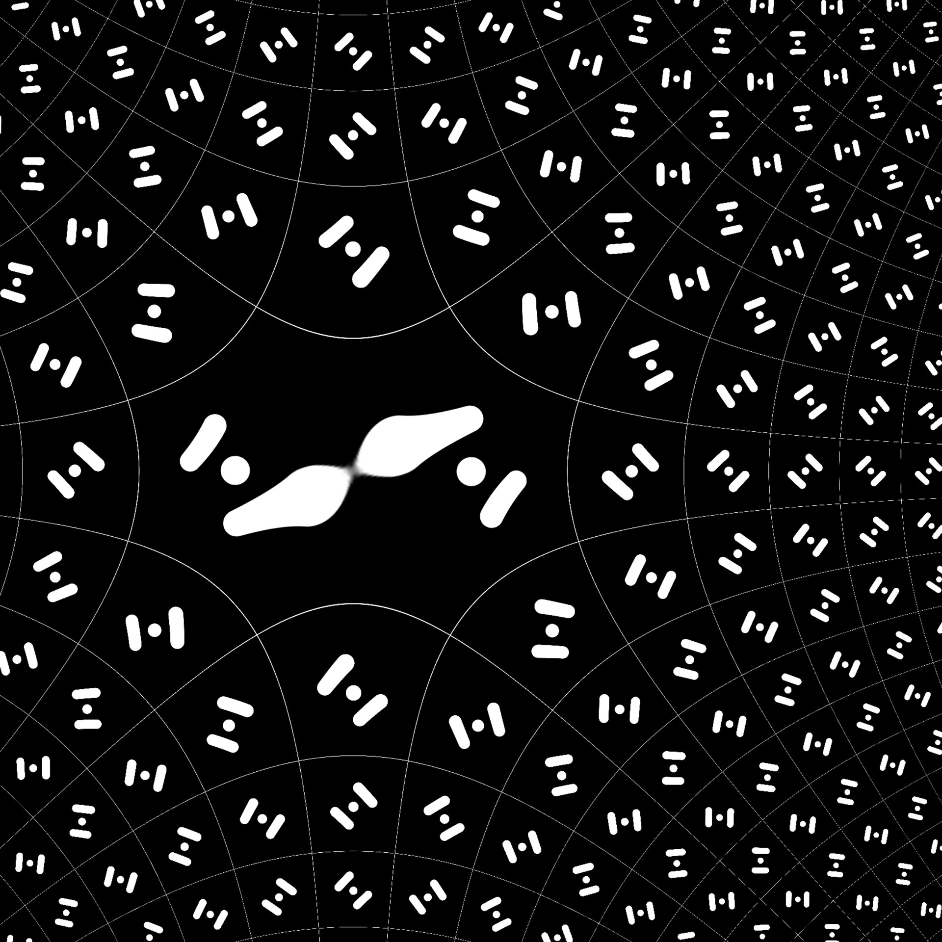

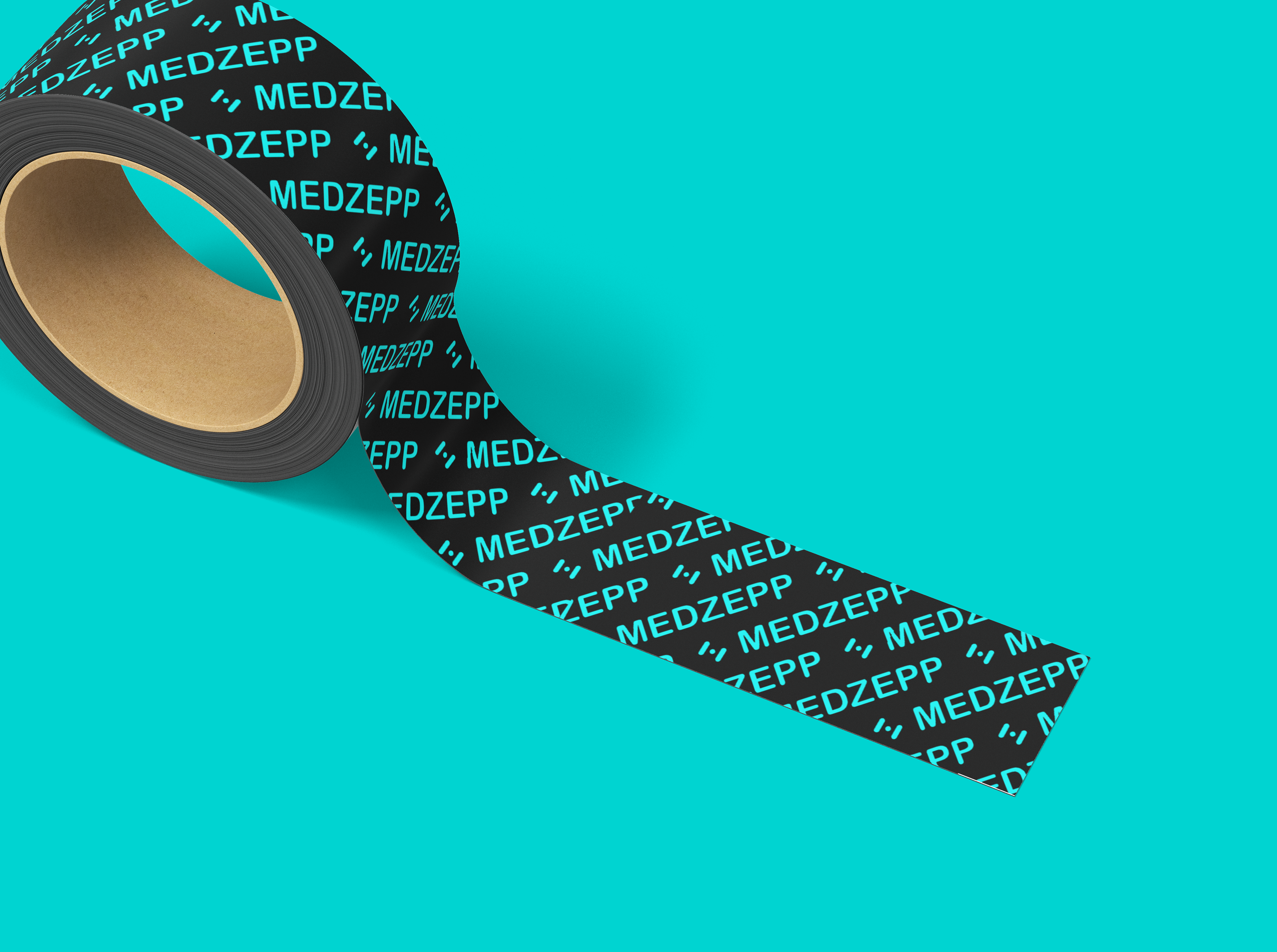
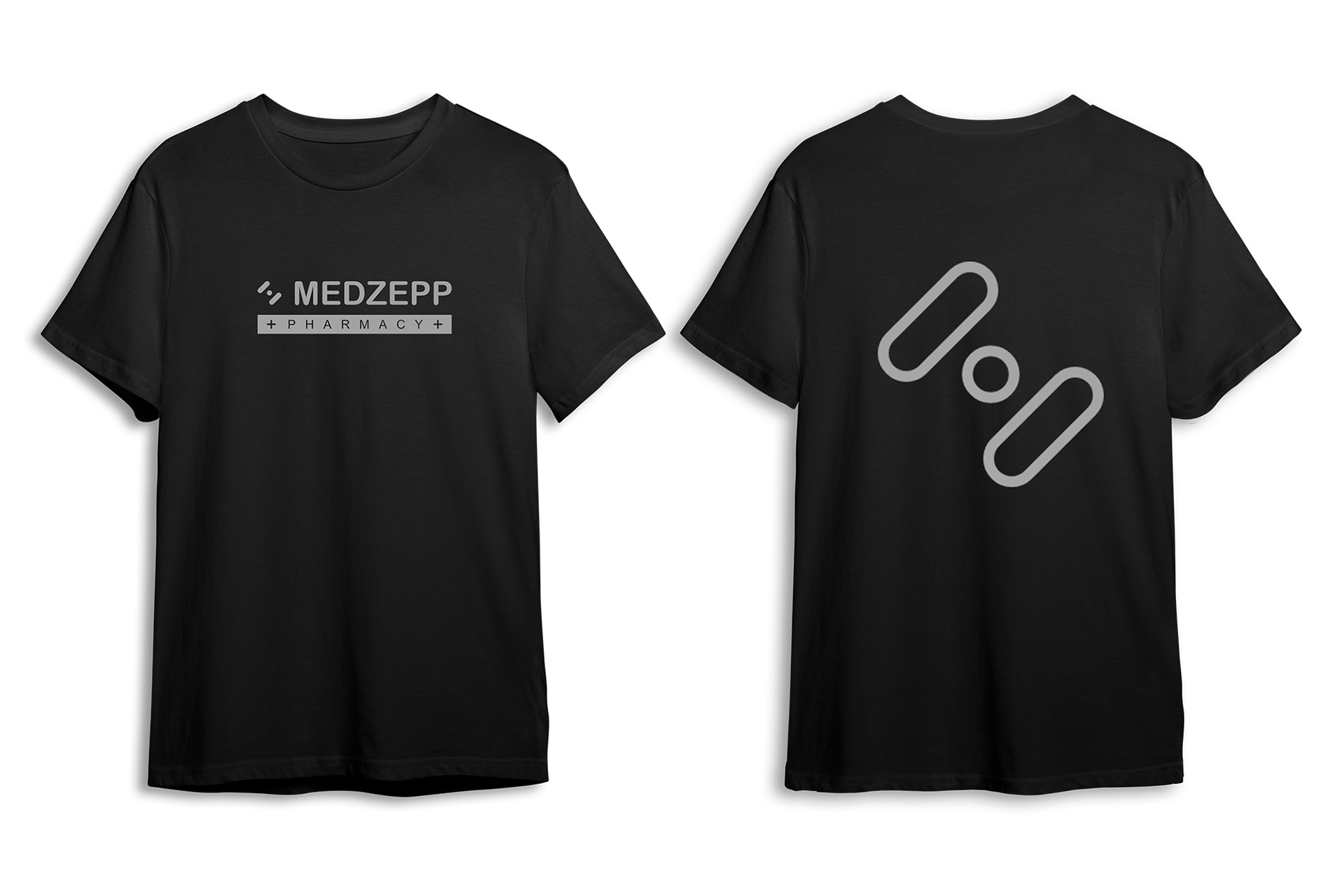
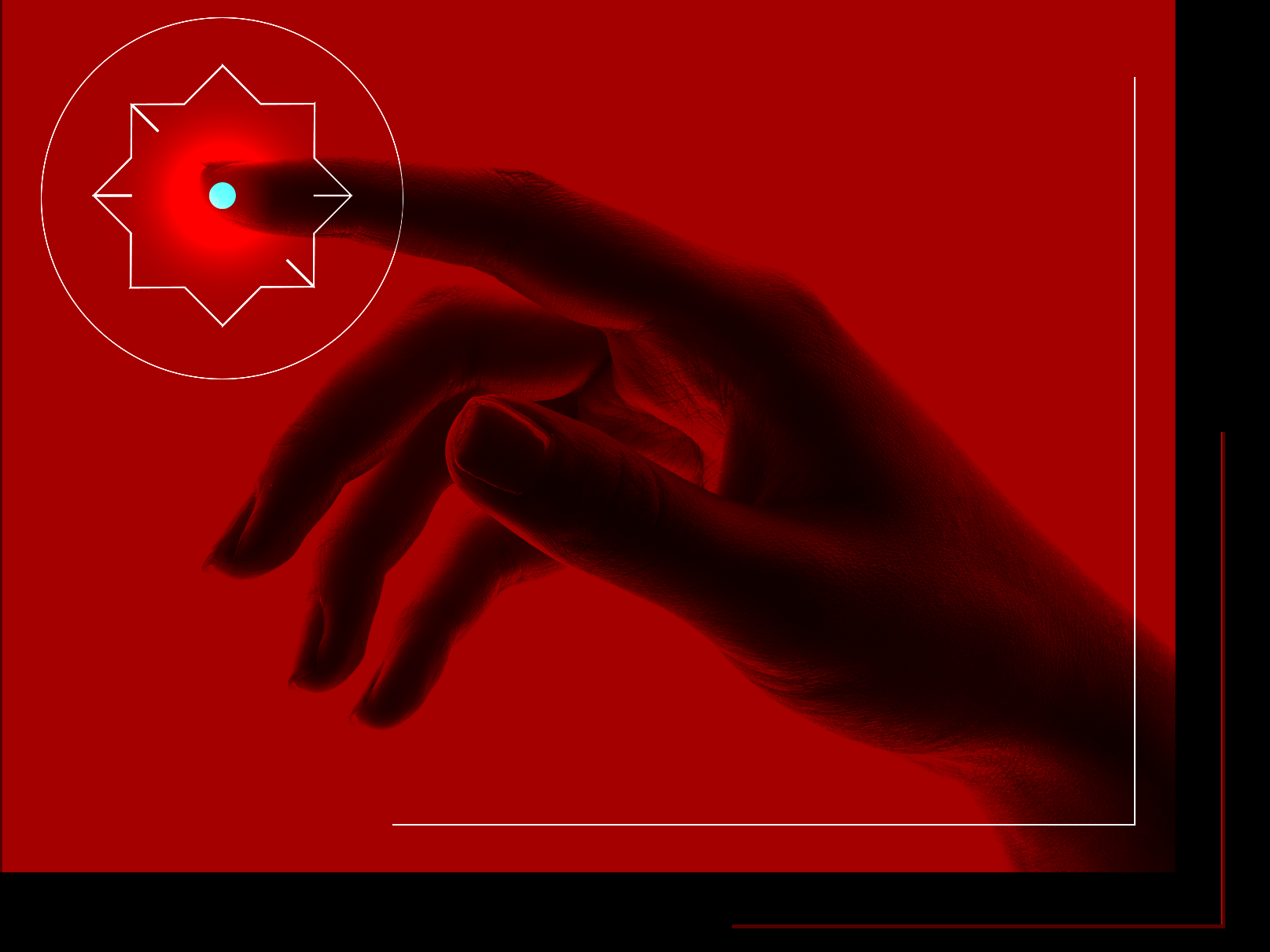
Patterns
One of the main elements in random brand identity, Patterns are intended to be repeatable to be used in wide variety of applications. Our inspiration comes from the random logo.